Stream Rebrand
Jan 2025 – Sep 2025
Evolving a fintech brand into a people-centred global platform through a staged rebrand focused on clarity, accessibility and operational adoption.
|
Rebrand · Design systems · Accessibility · Fintech · Global rollout
Brand Designer
Stream (formerly Wagestream)
Identity, rollout, systems, website transition
Regulated fintech , B2B, B2C & investor audiences
Role
Company
Scope
Environment
Stream needed to reposition itself as a long-term financial wellbeing platform while maintaining trust with existing users and partners. The goal was not to introduce a completely new identity, but to evolve the brand in a way that felt familiar and credible during a period of growth.
The brand had to communicate clearly to employees, employers and investors simultaneously, and support a large volume of marketing and internal output across global teams.
Challenge
I designed the new logo and led the translation of the identity into practical usage across marketing and internal communication.
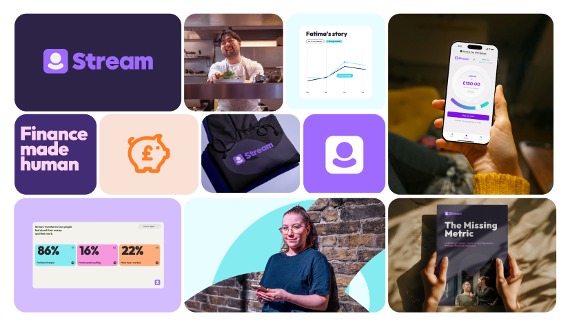
The logo became the first approved brand element by the founders and influenced the decision to bring the rebrand in-house rather than continuing with the external agency. I later supported the creation process for over 360 brand assets and built the templates and systems used to deliver them across three languages in a two-month window.
Following launch preparation, I supported product and web teams with frameworks and templates that enabled the new site to be delivered ahead of the rebrand launch.
My Role
Constraints
Regulated financial communication
Cross-team adoption required for success
Multiple audiences with different expectations
Large-scale asset creation under time pressure
Existing brand recognition to preserve
Implementation
The identity was designed as a progression rather than a replacement.
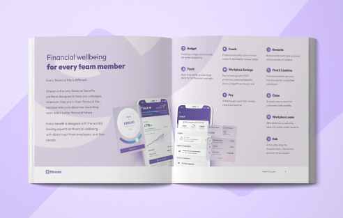
The logo is derived from the pay screen within the Stream app, reshaped to emphasise a human form. This created a visual metaphor for placing people at the centre of financial wellbeing and aligned with an early positioning direction of “for people, not numbers”.
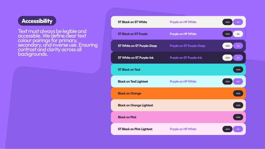
Colour evolved from the Wagestream palette but was adjusted for improved accessibility and clearer hierarchy. Typography used Outfit, an open-source font, reducing licensing cost while improving cross-platform consistency, particularly within Google Workspace sales materials.
The aim was familiarity with clarity: recognisable enough to retain trust, but structured enough to support scale.
Identity
The rebrand followed a phased rollout to reduce risk.
The website launched ahead of the rebrand using the new visual system while retaining the existing name and logo, allowing teams to adopt patterns before public transition. The full brand launch then replaced the remaining elements in September.
Because teams were already working inside the new structure, adoption was immediate rather than disruptive.
Rollout

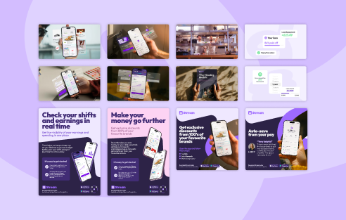
Rather than static guidelines, the brand was translated into operational tools. I created templates, file structures and reusable frameworks to support global asset creation. These enabled teams to produce work independently while maintaining consistency across languages and regions.
The system prioritised:
repeatable layouts
predictable hierarchy
accessible colour usage
cross-team usability
This allowed marketing and internal teams to generate output without relying on continuous design involvement.
Systems
I supported asset production across the creation of over 360 assets in three languages within two months.
Following launch, I continued supporting product and marketing through templates and frameworks integrated with existing libraries, enabling rapid deployment of new site content within a two-week timeframe.
Scaling
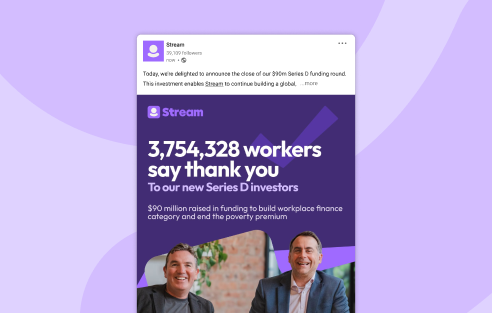
The rebrand provided consistent communication across customer, employer and investor audiences and supported the company’s positioning ahead of a $90m Series D funding round.
More importantly, the brand functioned operationally: teams could use it confidently without ongoing design intervention.
Outcome
I’m proud to have led the design of Stream’s rebrand at such a pivotal moment in its growth.
The evolved identity positions the company clearly for its long-term business strategy, with a stronger emphasis on people-first design and imagery. The positive sentiment around the new direction, both internally and externally, reinforced that the brand felt like a natural progression rather than a disruptive shift.
For me, this project demonstrated how thoughtful identity evolution can strengthen positioning while growing trust.
Reflection